Fitted
The responsive web app that is designed to help ANYBODY get fit fast!
Overview
Its not always easy for working everyday people to get into a workout routine that they can easily keep up with. Wanting to become a healthier you should never be a stress factor.
The goal of Fitted is to help ANY BODY who is wanting to become a better version of themselves succeed, by having many different short workout videos for all levels all in a welcoming and judgement free community.
User Stories and User Flows
Before starting out, I made sure to start with user stories and user flows. This helped me get an understanding of what it is that people want, so I can get a better understanding of how to help them.
“As a new user, I want to be shown how the exercises are done, so that I know I’m doing them correctly.”
“As a frequent user, I want to be able to share routines with my friends who may also be interested, so that I can encourage them to become healthier.”
“As a frequent user, I want to complete daily challenges, so that I can have an additional way to stay motivated.”
A User flow was created to get a better picture of how the user will go through a task. This helped me to see the different steps a user has to go through to accomplish the app to ensure that tasks are not too complicated to accomplish.
Wireframes
Once I got a good picture of how users will make their way through the app, I sketched out low-fidelity wireframes of each screen. This step helped me to start to see what direction to take the design.
Mid-Fidelity wireframes & Grids
I then took the idea from the low-fi’s into Figma and created mid-fidelity wireframes. With the help of grids I was able to align all of my objects into where they need to be on the screens and got a better consistency.
Moodboard
I created a couple of moodboards to help convey the message of the app to the designers. With this, the team can see some of the images that need to be in the design as well as what colors need to be used throughout.
The images and colors of the board are meant to show users that the app is diverse for all no matter what their fitness level is. This is what needs to be kept consistent throughout the design to ensure that all users feel like this was specifically designed for them.
Style Guide
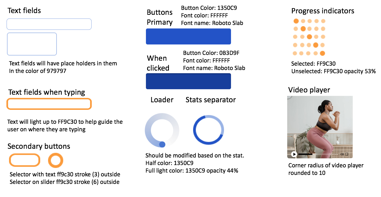
UI Elements
Typeface & Font
Colors
Iconography
High-Fidelity Prototype
After many iterations of the design and having a better understanding of what will make this product more accessible and easier to use, the idea for the high-fidelity prototypes became clear.
Animations
I added a few animations into the design in order to make it easier and more enjoyable for users. One of the most prominent being a hamburger menu, which gives them more options to get around the app. I have added logos on the top screens to where if selected will guide users back to the home back to the home page. Users have the option to slide left or right on the screen and get all different varieties of work out videos.
Responsive Design
After finally agreeing on the final design for each mobile screen, It was then important to design for different breakpoints. I designed both the tablet and desktop versions to make this product more inclusive.


